1994 Donruss: #492 Jeff Nelson
I do not like this card.
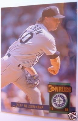
The imagery on the card is horrific. Nelson's pitching arm looks like it was made out of bone spurs. Not only does the most vital part on Nelson's body look like it is exploding, the center piece of the card seems like it is Nelson's back. Why would you make the least interesting part of an athlete's body the focal point of a baseball card? The angle of the photo doesn't help either. It looks as though Nelson's uniform and the crowd in the background have merged together to form one enormus blue-grey blob. Just looking at the card now I am getting a head ache, next time try and add at least one vibrant color somewhere on the card. However, there is one redeeming image on the card: Jeff Nelson's hair. For eons, the mullet has been an exceedingly risque hairstyle, but a man like Jeff Nelson can pull off the business in the front, party in the back style with ease. If you thought the party in the back was looking even more awesome than normal, you were right because it has an extra element of awesomeness, manly blonde curls. This added awesomeness, mixed with undeniable knowledge that Nelson and Randy Johnson had the same barber in 1994 saves the image and makes a solid 5 out of 10.
The style, however, cannot save the overall value of the card. In 1994 baseball card companies were just realizing that if they make their cards really shinny, stupid kids will spend countless amounts of quarters buying them. Donruss only got half the memo. While they did make their logo really cool and hip by making a baseball go through the D, it is twice the size of Nelson's name and the only thing that is shinny. Speaking of Nelson's name, if I didn't have an excellent second grade cursive teacher I would think his name is Feff. Feff. If you thought things couldn't get worse, you thought wrong. Someone on the Donruss creative staff thought it would be a good idea to split the 19 and the 94 in half inbetween the Mariners logo. Surely someone besides me thought the 19 and 94 looked more like a serial number than the actual year, possibly increasing the cards value into the 10 cent range. I guess not. The style of the card is flat out awful, a 0 out of 10.
Frankly, I have no idea why I started with such a horrible card, but that's irrelevant since I already wrote this entire blog. Overall rating: 2 out of 10
No comments:
Post a Comment