I like this card.
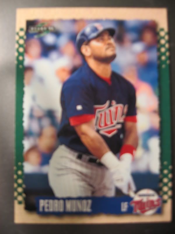
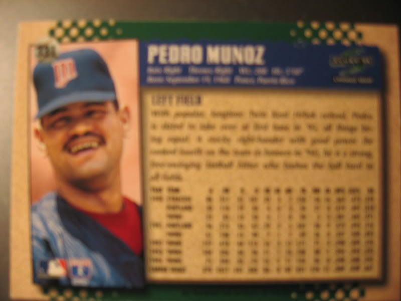
When I first look at this card, the first thing I noticed was Munoz's pose. Instead of going with the tradition bat on the shoulder, eyes into the camera approach or the more recent in-game action shot, this photographer thought he would capture the native Pedro Munoz in his natural habitat, the on-deck circle. To me, it's fairly obvious Munoz is asking the Sun God Sol for extra strength so he can ground out to third with more velocity then his prior at-bat, but to most he just looks like he is day-dreaming since he played for the 1995 Twins. The angle the photo is taken at is really good, it gives a full frontal of Munoz yet he isn't looking at the camera straight on. The background crowd blends nicely with the away jersey and really makes Munoz himself stand out. On the reverse side, Score adds a small photo of Munoz's head. This photo is hilarious because it confirms a well known baseball rumor that Pedro Munoz never owned a toothbrush as well as highlighting his awesome moustache. Seriously thought, the reverse side photo is a nice touch that many cards don't have, either because it is too costly or just to plain difficult to do. It gives an alternate photo to look at and makes both sides of the card worth looking at, thus making the card more marketable to kids who like to look at cool ballplayers, like me. Basically this photo is awesome because it not only shows Pedro Munoz the baseball player, but Pedro Munoz the Sun God worshiper as well. Overall photo rating is a 9 out of 10.
The style of the card is one I have a soft spot for. I love the cream and green outline, even thought it has not direct style relation with baseball, but I feel it makes the photo on the card even more prominent. The company throws its brand name in a small logo in the top left corner, but since there is nothing but crowd background in the corner it is still noticeable. The only gripe I have in the style is the choice for a blue tag-line. I mean, with a green and cream colored outline, blue doesn't exactly fit in as the third color of choice. Personally, I would have gone to a light black or another off cream or green to fit in with the rest of the card. Regardless, it is still a lovely card. Unlike the Nelson from yesterday, I was able to get the back of this beauty, and it fits in perfectly with the rest of the card. Sticking to the plan on the front, there is a boarder of cream and green, and the traditional listing of career stats, birthday, and a fun fact. The front and the back blend together perfectly, helping give the style of the card a great rating of 9 out of 10.
Since I started with an ugly card, I felt I needed to come back with one of my favorites. Overall rating: 9 out of 10.
No comments:
Post a Comment